Loginom Data Quality Visualizer
I was part of Data Quality visualizer project team as UX/UI designer. Data Quality visualizer helps to evaluate data quality for analysis.
Why is it so important? Analysts spend around 80% of time to cleaning and preparing data. This is the very first and very resource-intensive part. The Data Quality visualizer created specifically to help the analyst evaluate how data is suitable for analysis and show more detail.
You can try Data Quality absolutely free in Loginom CE.
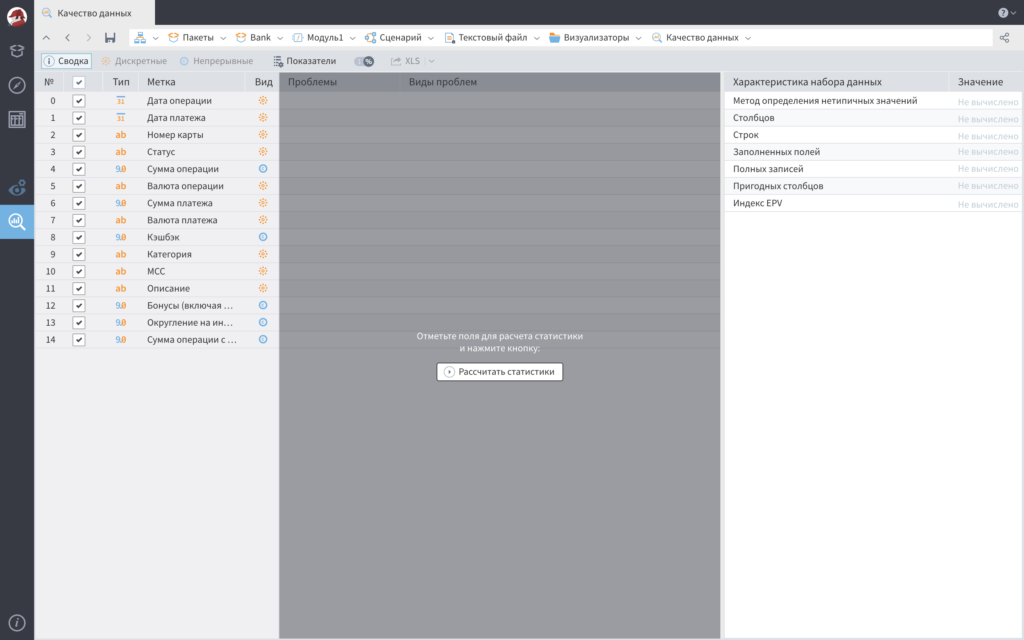
First of all, you need to select which columns of the table you need to check the quality of the data and click the «Calculate statistics» button.
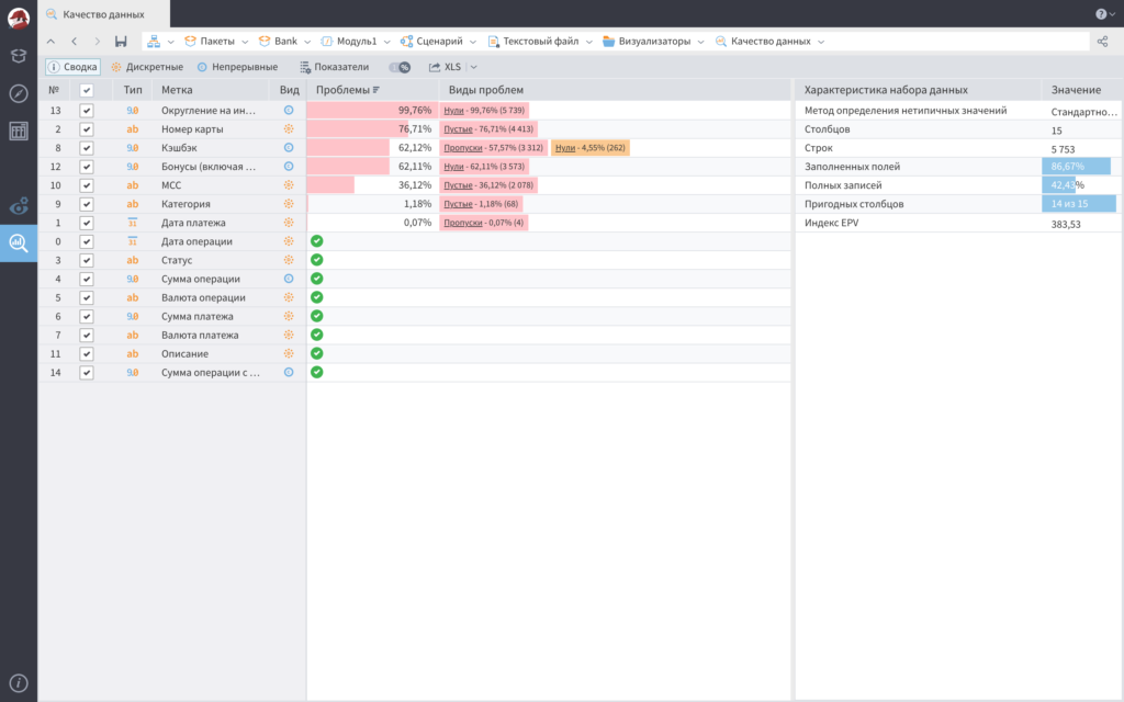
At this step, the visualizer displays general information about the data — possible problems, such as empty values, zeros or completely missing values, the amount of data filled and suitable for analysis. Already at this stage, you can understand whether it is worth continuing to work with the data or whether it makes no sense.
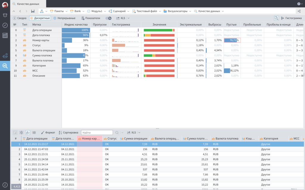
You can view more detailed information separately for discrete and continuous data.
For example, this screen shows that more than 76% of banking transactions don’t contain a card number. Why? It’s not clear yet, but this information may indicate that these data are no longer suitable for some specific analytical purposes.
This saves a lot of time for the analyst, helping him to focus on data analysis, and spend time on useful data. I’m glad I was part of team created this powerful data analysis tool!